Headline: DeWine Unveils Reimagined, Previous Slogan. (Not the Onion)
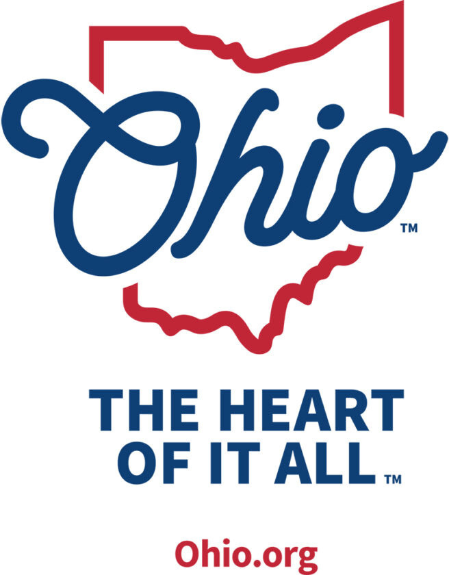
Apparently Ohio has a new tourism slogan, “Ohio, the Heart of it All” which is exactly like the old tourism slogan, “Ohio, the Heart of it All.”
It has a new logo and branding that might as well have been designed by…what’s something that doesn’t design things very well? A Great Dane? Microsoft Paint? Liza Minnelli?
Well, whatever. The point is that it’s ugly. Like, I can’t even with this design. Is it supposed to be inspired by the first time we had this slogan in 1984?
That script is awful. Like, is it supposed to be retro or something? Because it’s not modern, that’s for sure. And that has to be the ugliest blue and red combo I’ve ever seen.
Oh and wait until you read the genius marketing copy the state paid someone a ton of money to write.
Ohio, The Heart of it All is more than the state’s brand theme, it’s a place in people’s minds, and in their hearts. It speaks to Ohio’s central geographic location, but just as importantly, it conveys that Ohio is the heart of the heartland. The heart-shaped state. The home of heartwarming stories and heartfelt joy. It aptly describes a place that is incredibly diverse, from 75 state parks to big city amenities which include a thriving arts and culture scene and award-winning culinary experiences, to the charm and comfort that can be found in its distinctive neighborhoods and historic small towns.
Are you kidding me with this? Is this a joke? Did Chat GPT spit that out? That has to be AI generated.
No, no. I take it back. AI would never produce such, just…awful word vomit.
Shame on you, Ohio. We deserve better.
But then again what did I expect? All Republicans ever do is take us backwards. Sometimes to the Dark Ages, sometimes to 1984. Why should this be any different?
🤦🏻♂️